Yonly
Keeping your online world private through tunneling, ad filtering, and prevention tools.
Keeping your online world private through tunneling, ad filtering, and prevention tools.
- Where does an onboarding end? (Thought process)
The observation
One button. That is the whole story.
A VPN does its best work in the background. Yonly stops trackers, hides your identity, filters ads, none of it visible. You do not see what it catches. You do not notice the speed difference unless you are looking for it. For someone who just installed the app, it can feel like nothing is happening at all.
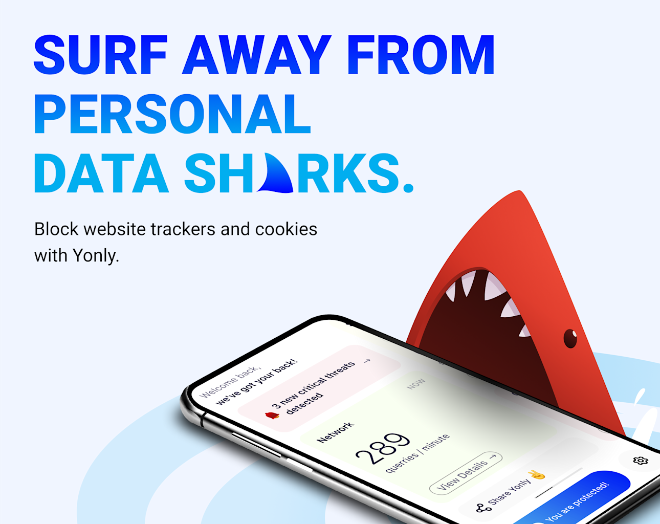
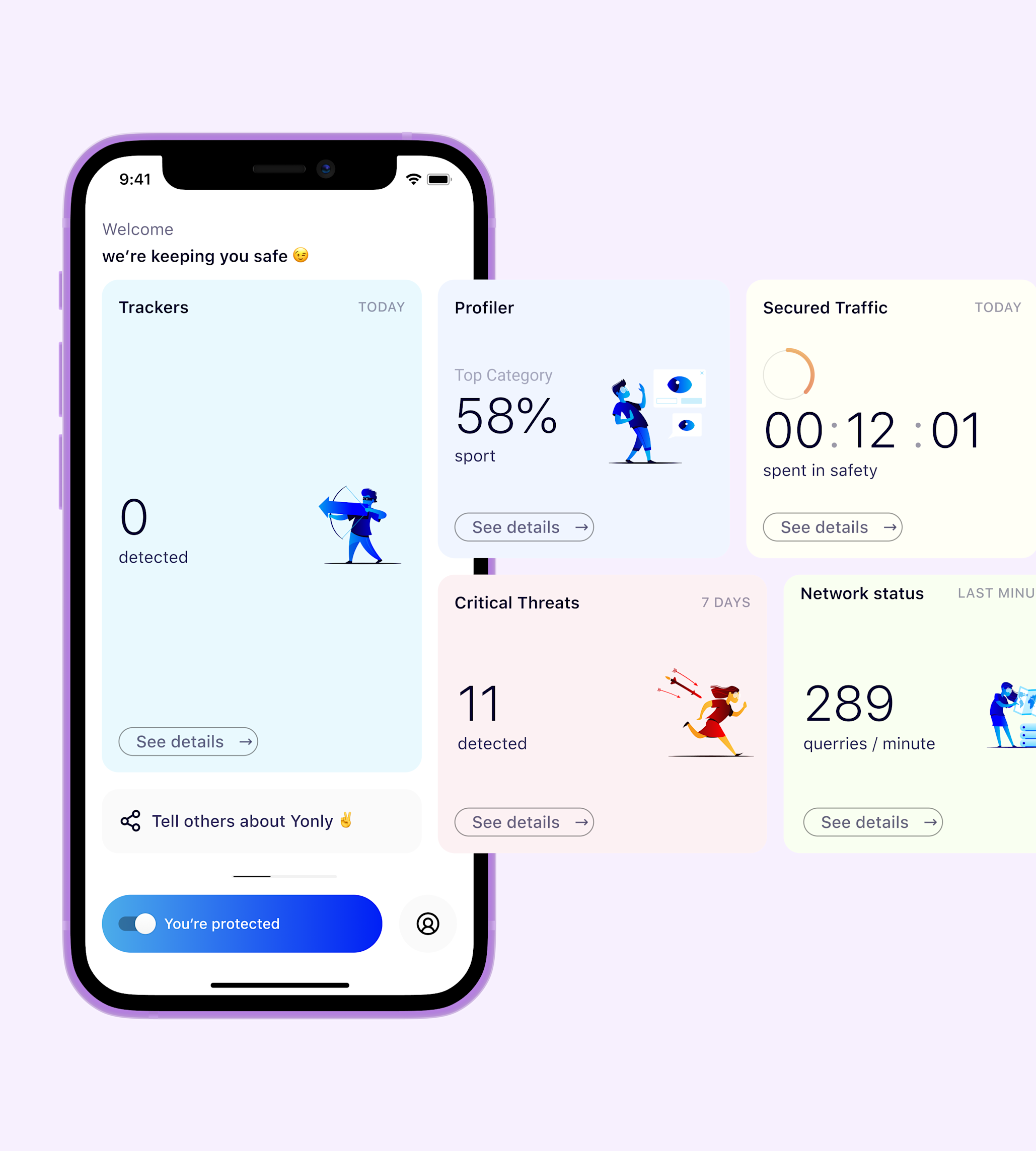
The design response was not to explain more. It was to make the one thing the user does feel like it counts. When you switch Yonly on, the interface reacts. Red turns to blue. Illustrations shift. The dashboard lights up. The button gives the user a moment of agency and gives the product a moment to perform. That single interaction ends up carrying a lot of weight.
The onboarding
Making VPN simple, clear, and personal
The onboarding was redesigned around one insight: it does not end when the setup flow does. It ends when the user sees something real. The first time the dashboard shows actual blocked trackers from actual browsing; that might come minutes after install or hours later.
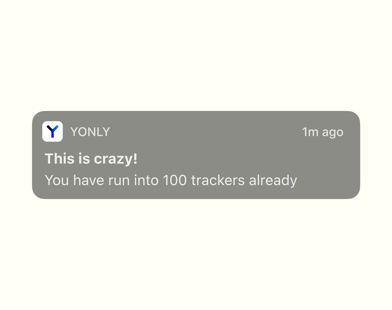
The onboarding runs in two acts. The first gets the user through a clear, frictionless flow and to the button. The second is a notification that brings them back when the dashboard has something worth showing. The wow moment is the data and the animation together; proof the app has been running while they went about their day.
The visual style came from the agency. The design system was built on top of it. One decision, one button, one clear state.
Read how the onboarding was designed
The dashboard
Numbers without context are just noise
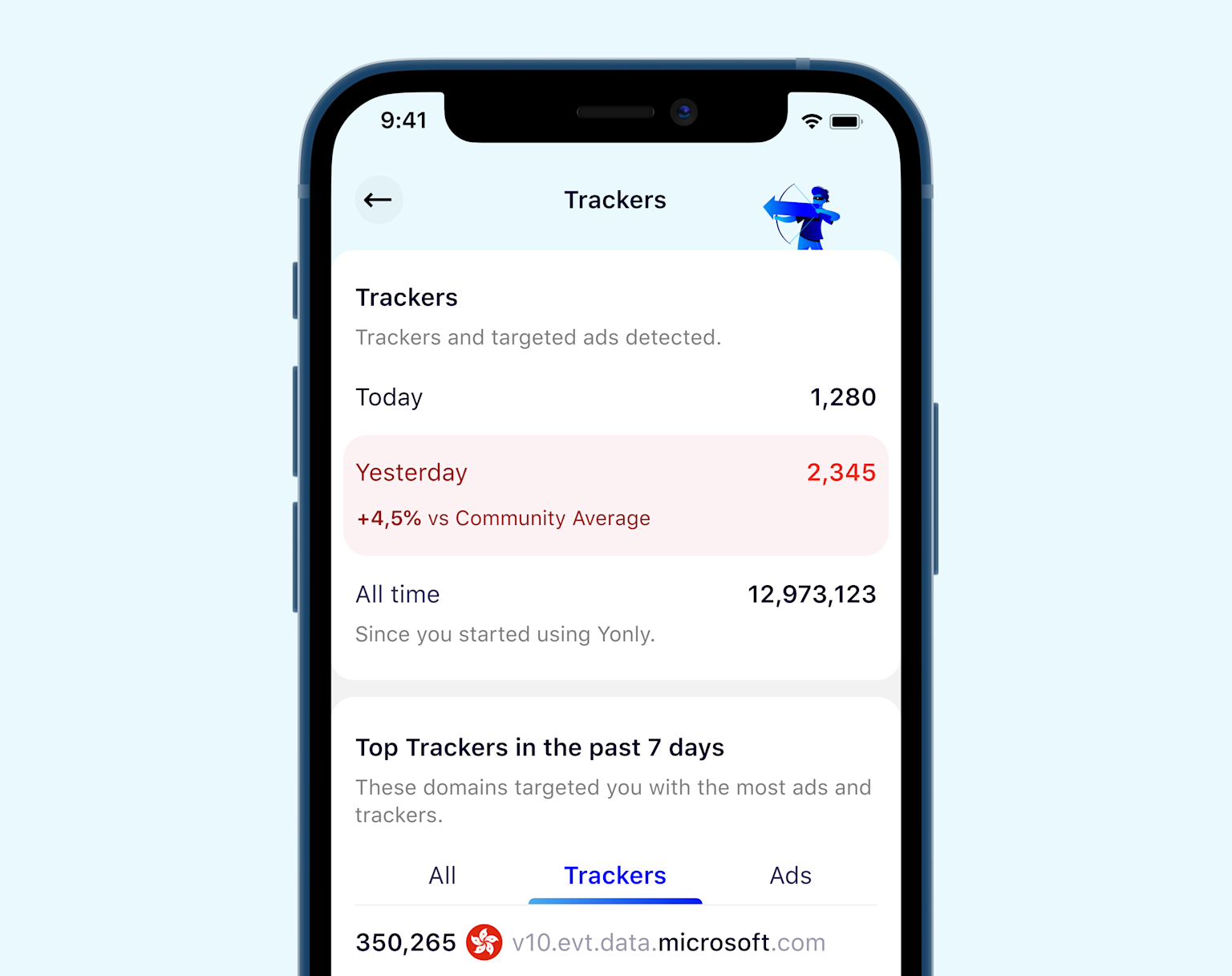
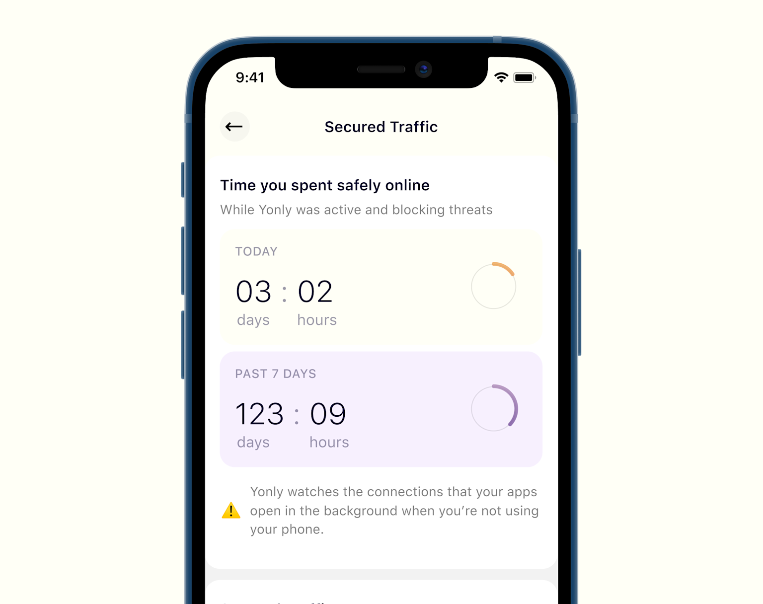
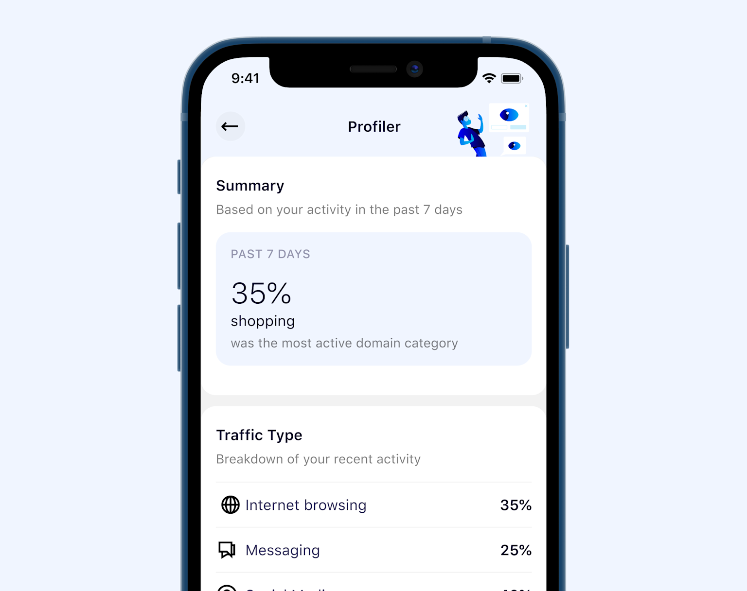
The dashboard redesign started from a simple problem: a thousand blocked ads does not mean much on its own. The question is what that actually represents; what was not collected, what was kept private, what it adds up to.
The redesign reframed the data around what it means rather than how much there is. The dashboard becomes something that gives people a reason to keep the app, not just a record of activity.
The campaign
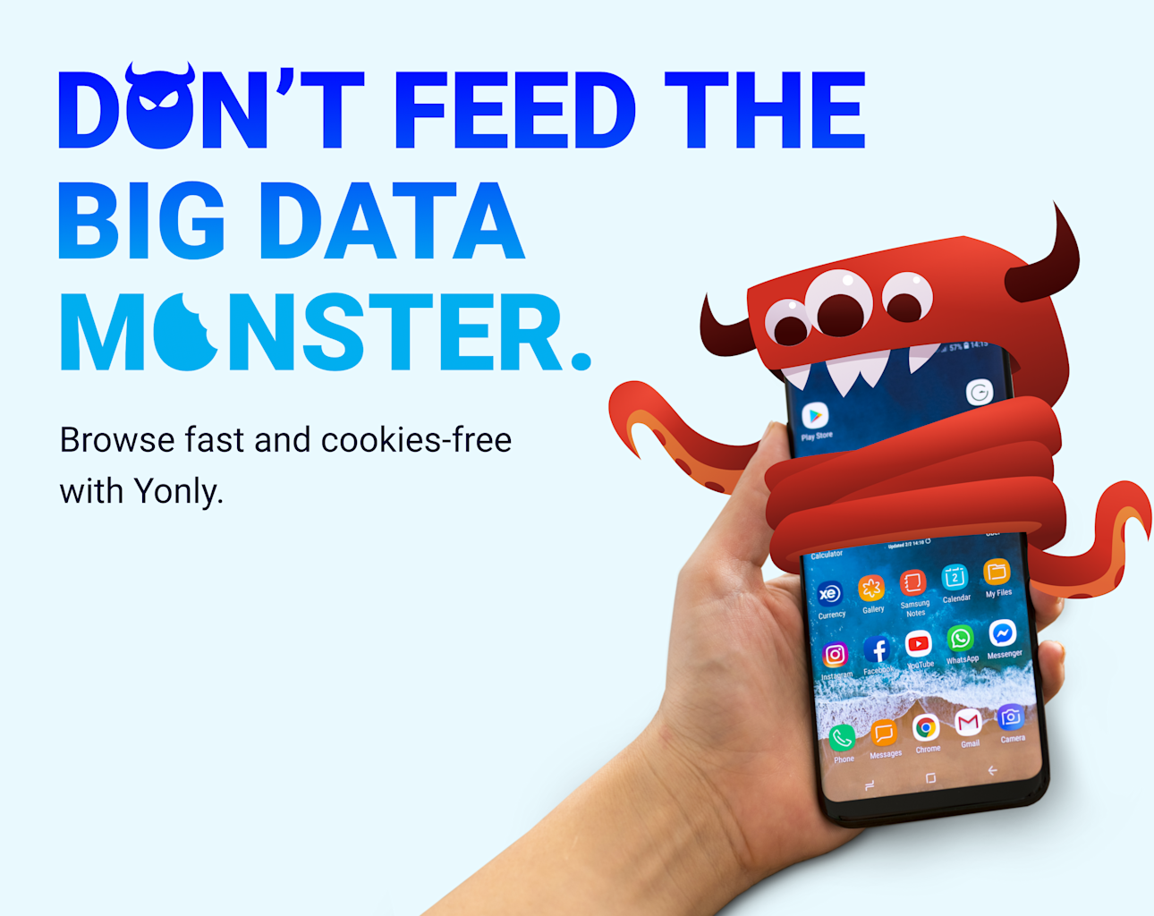
Don't feed the big data monster
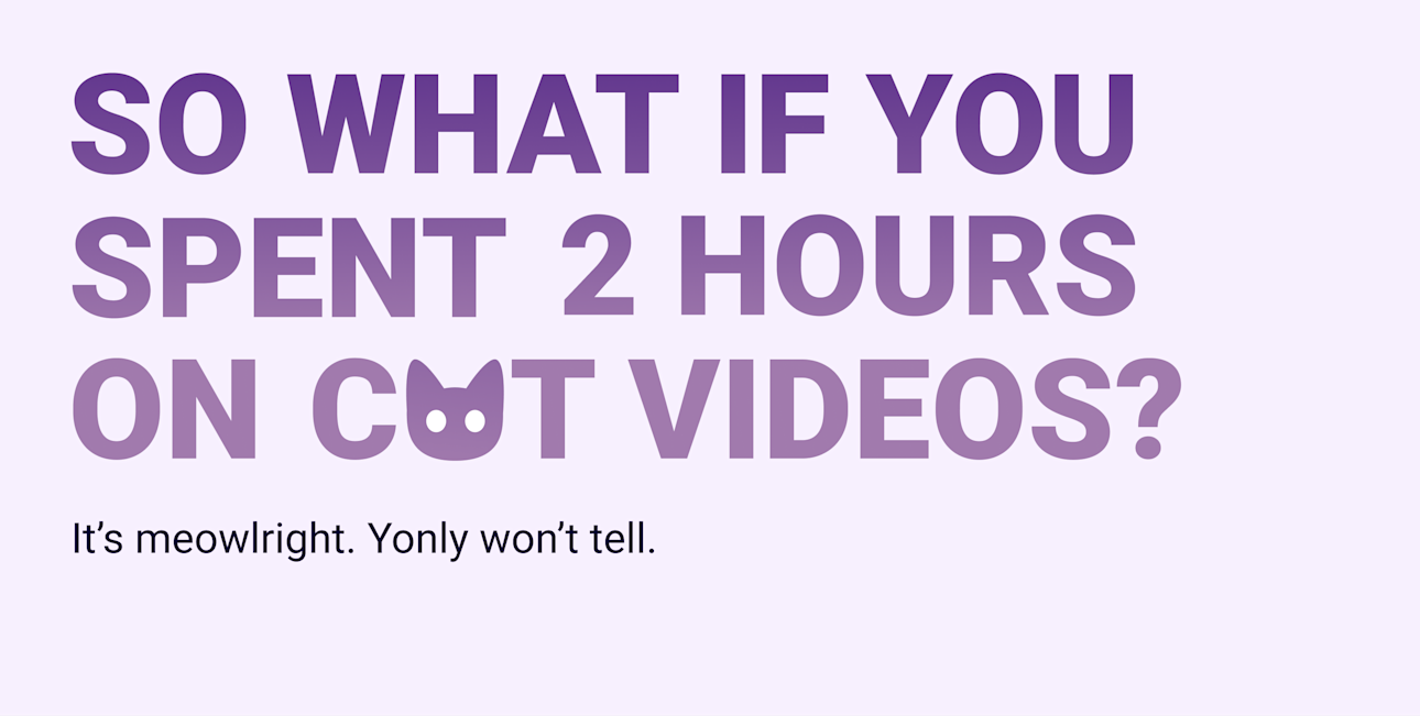
The campaign was built with the PM to give Yonly a standalone argument against big data dependency. Rather than treating data collection as an abstract risk, the concept gives it a character; something with a face, an appetite, a name. Easier to push back against something you can point at. The tone stays approachable rather than alarming, which is where most privacy campaigns tend to lose people.