The problem
The gap between promise and proof
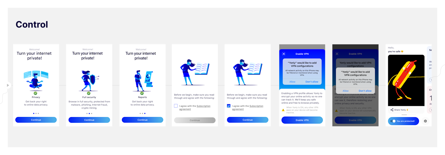
By the time a user opens an app for the first time, expectations have already been set; through ads, a landing page, word of mouth, or an App Store description. It is the product that must then deliver on those promises. This alignment is especially critical during onboarding. For a product like Yonly, where the core value is intentionally hidden from view, this stage can be particularly challenging.
The research set out to answer three questions: how do users feel about privacy, how do they perceive Yonly as a product, and where does the onboarding experience succeed or fall short?
The research
The insight hiding in research guide
Unmoderated interviews were conducted through the Userlytics platform, managed by the UX researcher. Participants were evenly split between iOS and Android users, creating a diverse pool to surface a broad range of attitudes and behaviours.
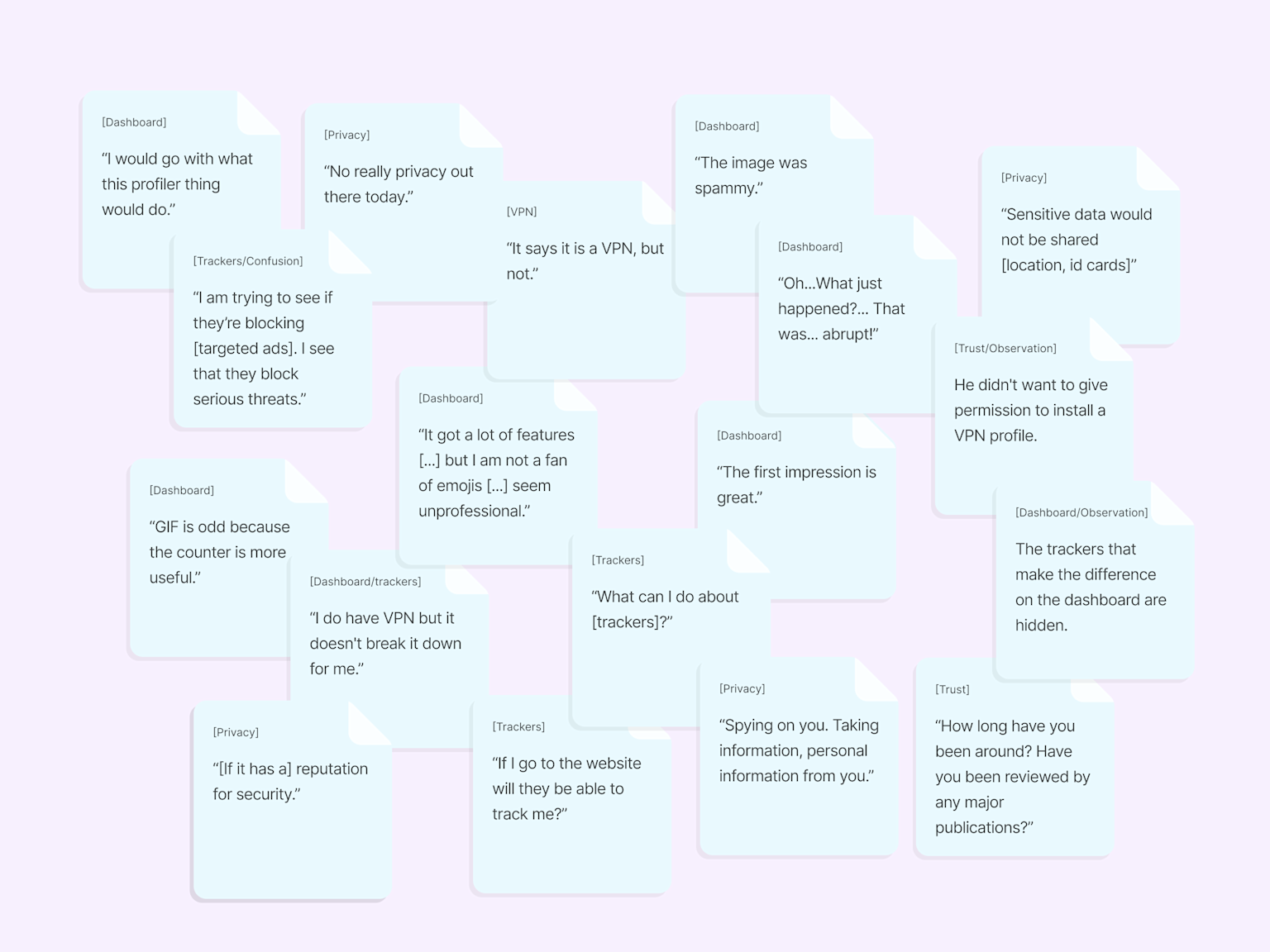
The research combined attitudinal questions with scenario-based testing. Participants were asked to switch Yonly on, browse their favourite websites, then open the dashboard again. What they found surprised them: in just a short amount of time, the numbers had filled up. Trackers blocked, ads stopped, a profile built. The reaction was immediate and genuine; nobody expected that much to have happened so quickly.
That moment became the product idea. The research guide became the design brief. If this was the moment that made the value of Yonly real and felt, then the onboarding needed to be redesigned to recreate it deliberately; not as a test scenario, but as the natural first experience of the product.
The solution
Stop explaining. Start showing.
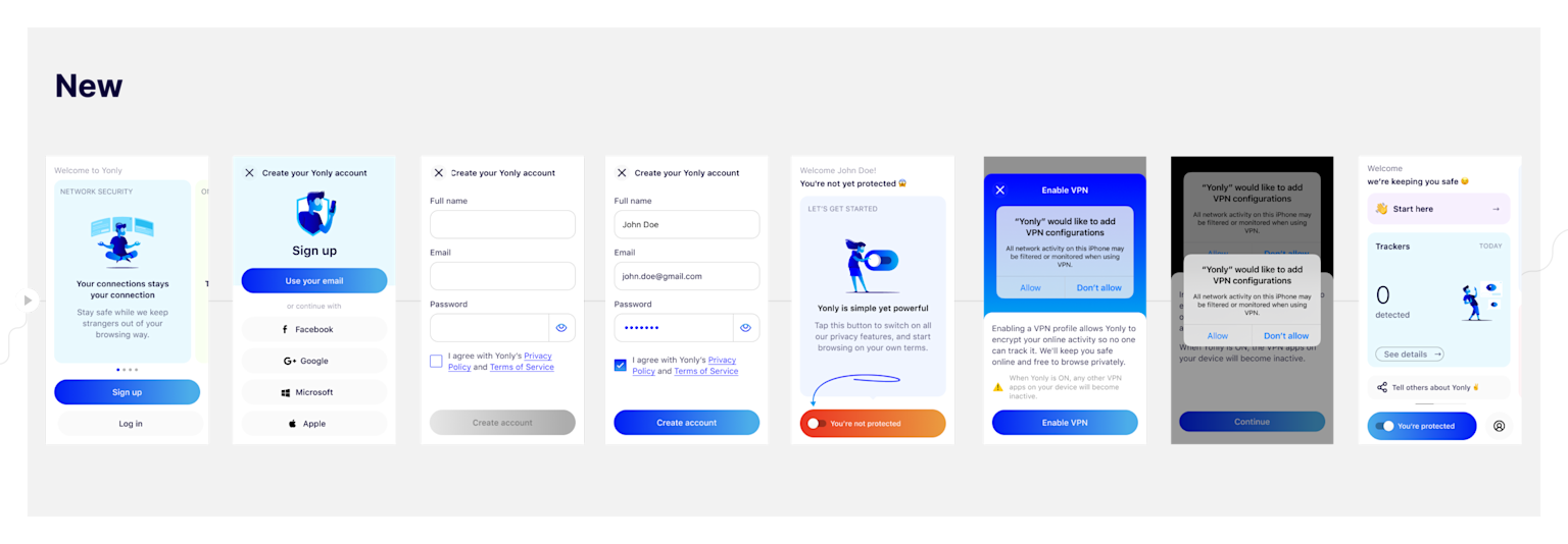
Based on the research findings, several key adjustments were made to the onboarding. The quirky GIFs that tried to communicate the product value in a lighthearted way were removed; they were not working, and in a security context they created the wrong tone.
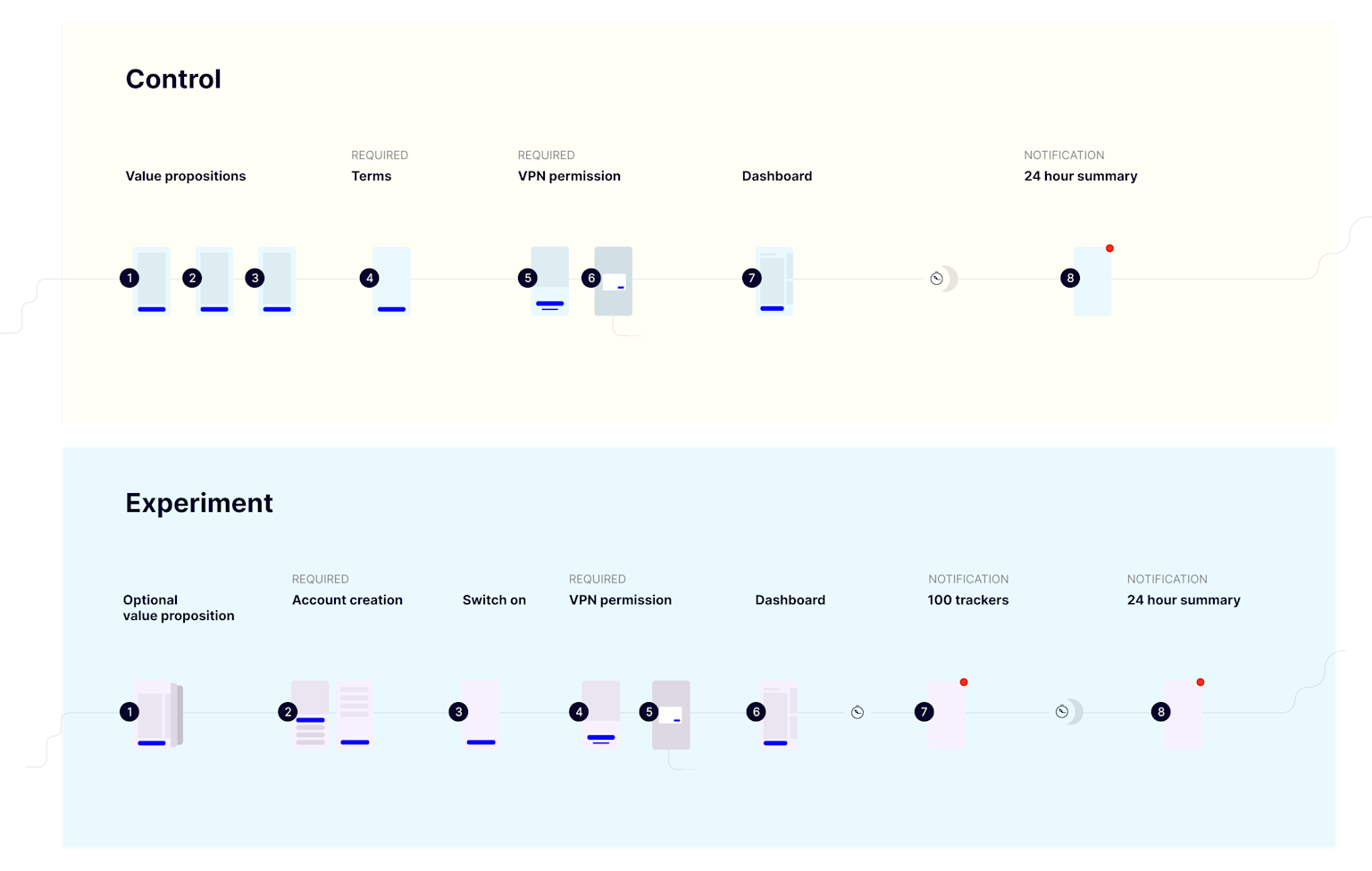
In their place, the dashboard itself became the hero. When the user switches Yonly on, the interface reacts: the button shifts from red to blue, the illustrations transition into protection mode, and the whole dashboard comes alive with colour. The idea is that once turned on, everything works together visibly; the protection is not just running, it looks like it is running.
And rather than waiting 24 hours, a notification was triggered once 100 trackers were collected; bringing users back to the dashboard at the moment when the wow factor was highest.
The conclusion
While other product decisions followed from this research, this case study focuses specifically on how the onboarding was redesigned to create a faster, cleaner, and more impactful first experience. The research did not just validate assumptions; it reframed what onboarding was supposed to achieve in an unexpected way.