LEAP
Renewing the brand identity of the leading conference on human resources.
Renewing the brand identity of the leading conference on human resources.
The observation
A series of moments
The identity work started with the guest, not the logo. Guest mapping; tracing the full arc of a participant's experience from the moment they arrive to the moment they leave. What is in the bag at registration? What is there to do between talks? How does the stage feel when a speaker walks out? Every touchpoint is a decision someone made. The journey map became the actual brief; not just what LEAP looked like but what it felt like to move through it.
The identity
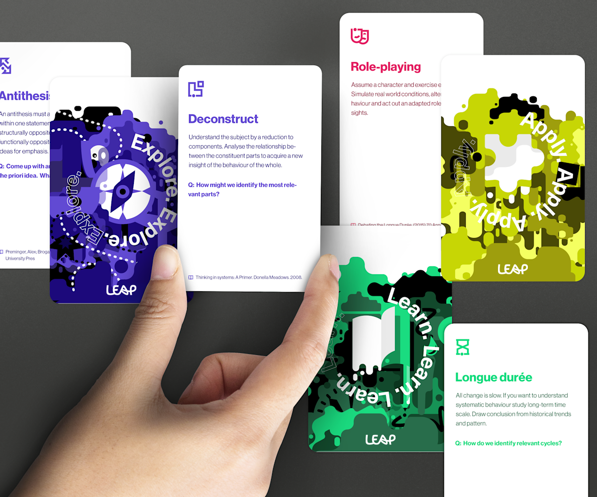
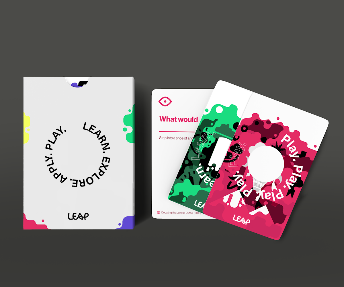
Learn, Explore, Apply and Play
The name is an acronym and a direction at the same time. The identity had to match that energy; bold, colourful, nothing that could be mistaken for a standard HR conference.
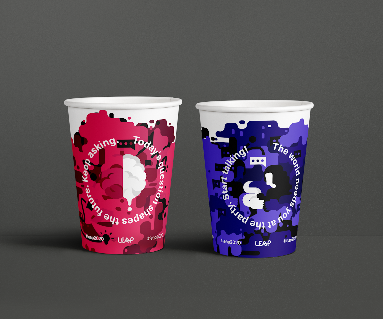
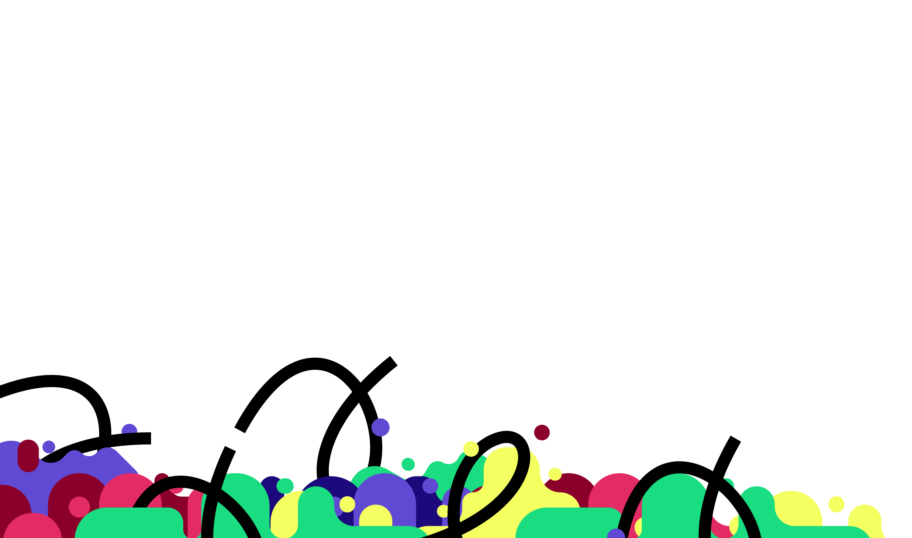
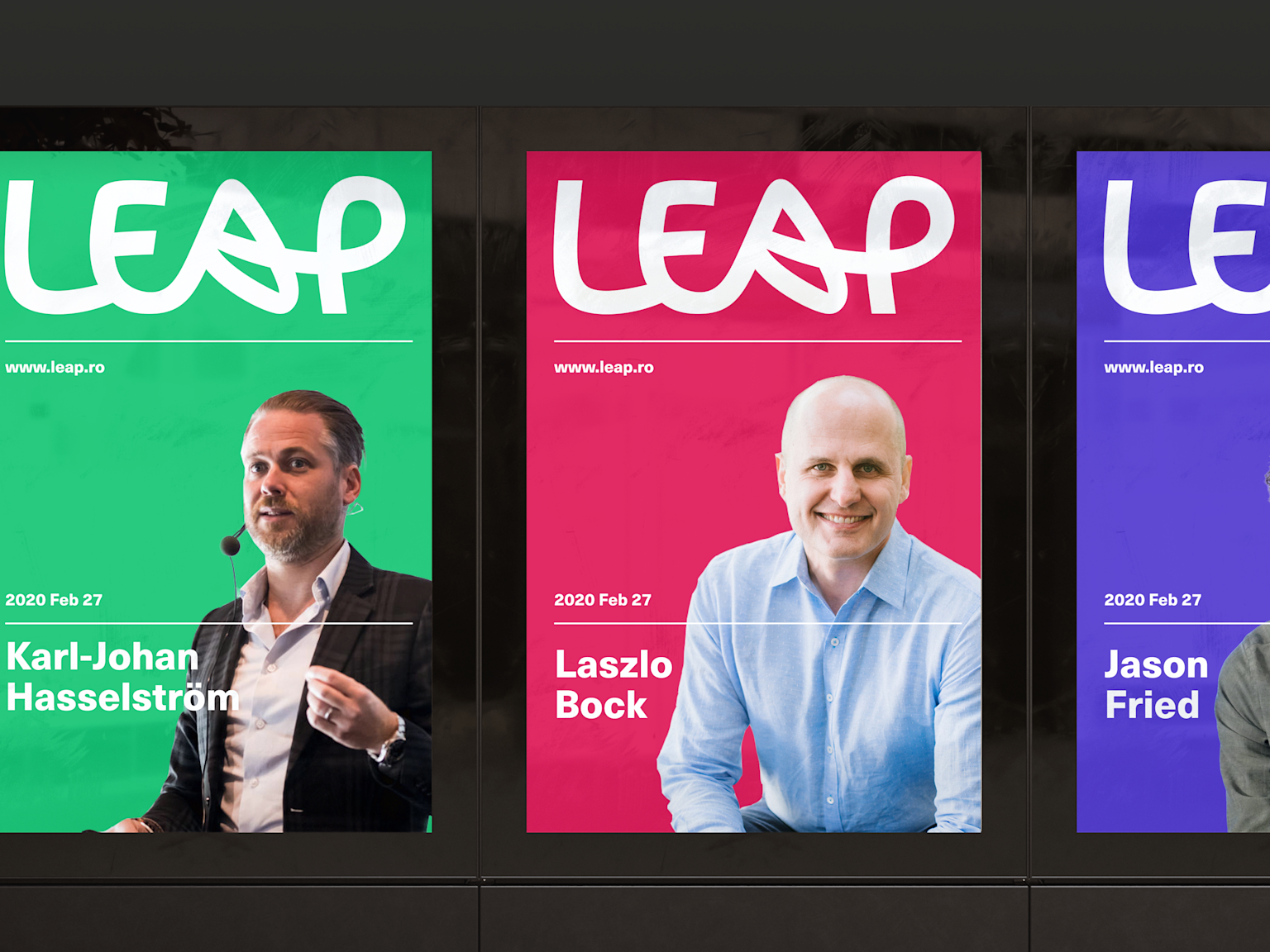
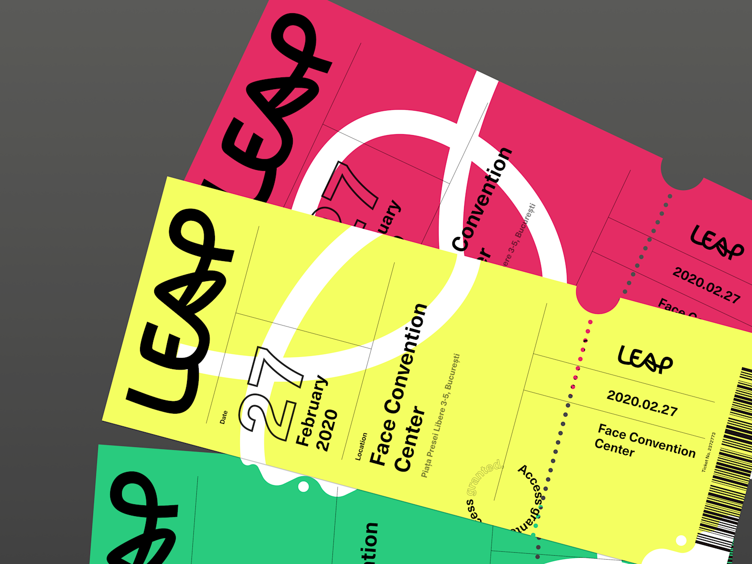
At the centre is a bespoke logotype where the A becomes a dynamic mark. Bold colour blocks and layered illustrations build out a visual language that holds together without becoming predictable. It ends up feeling closer to a festival than a corporate event, which was the point.
The experience
Small details, big impact
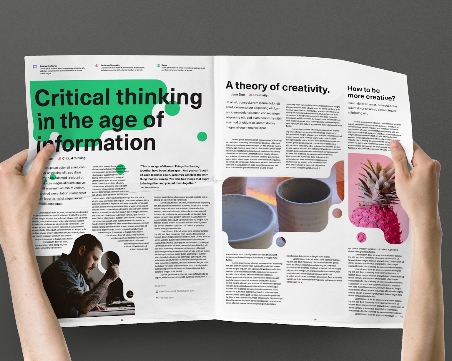
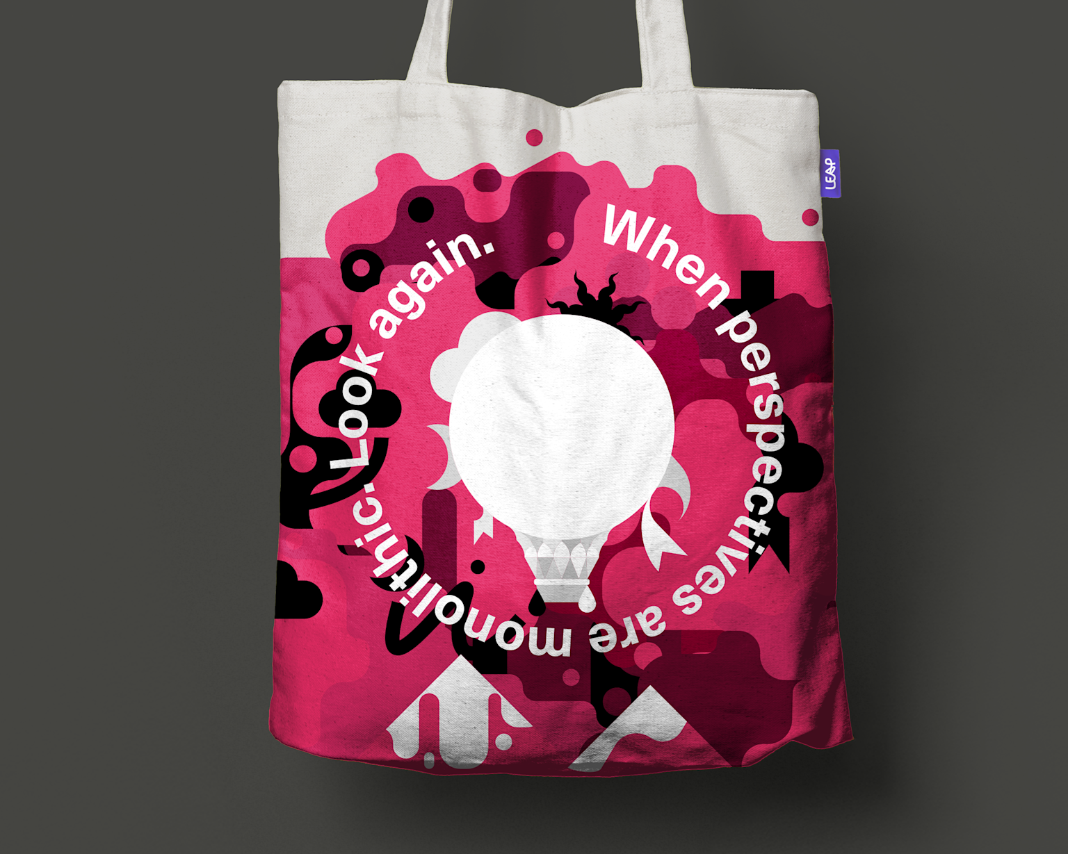
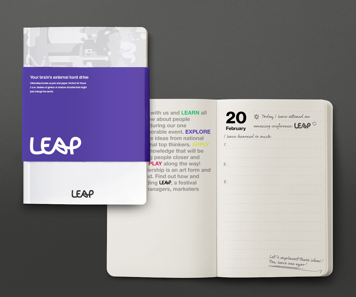
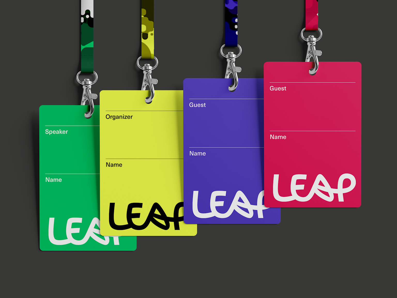
The experience design went well beyond the stage. The guest journey shaped decisions at every scale; exhibition layout, interactive activations, speaker planning, goodie bags, stationery, anything people would touch or see. All of it in the same visual language.
The details are where this kind of identity earns its keep. Consistent enough that people start to recognise it. Flexible enough that it does not feel the same twice.
See more about the event here.