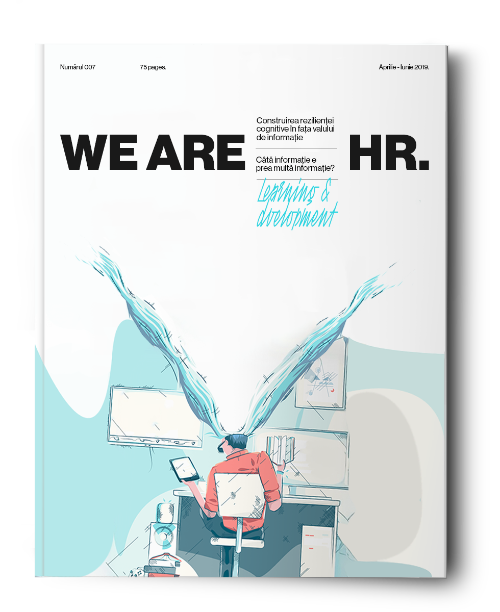
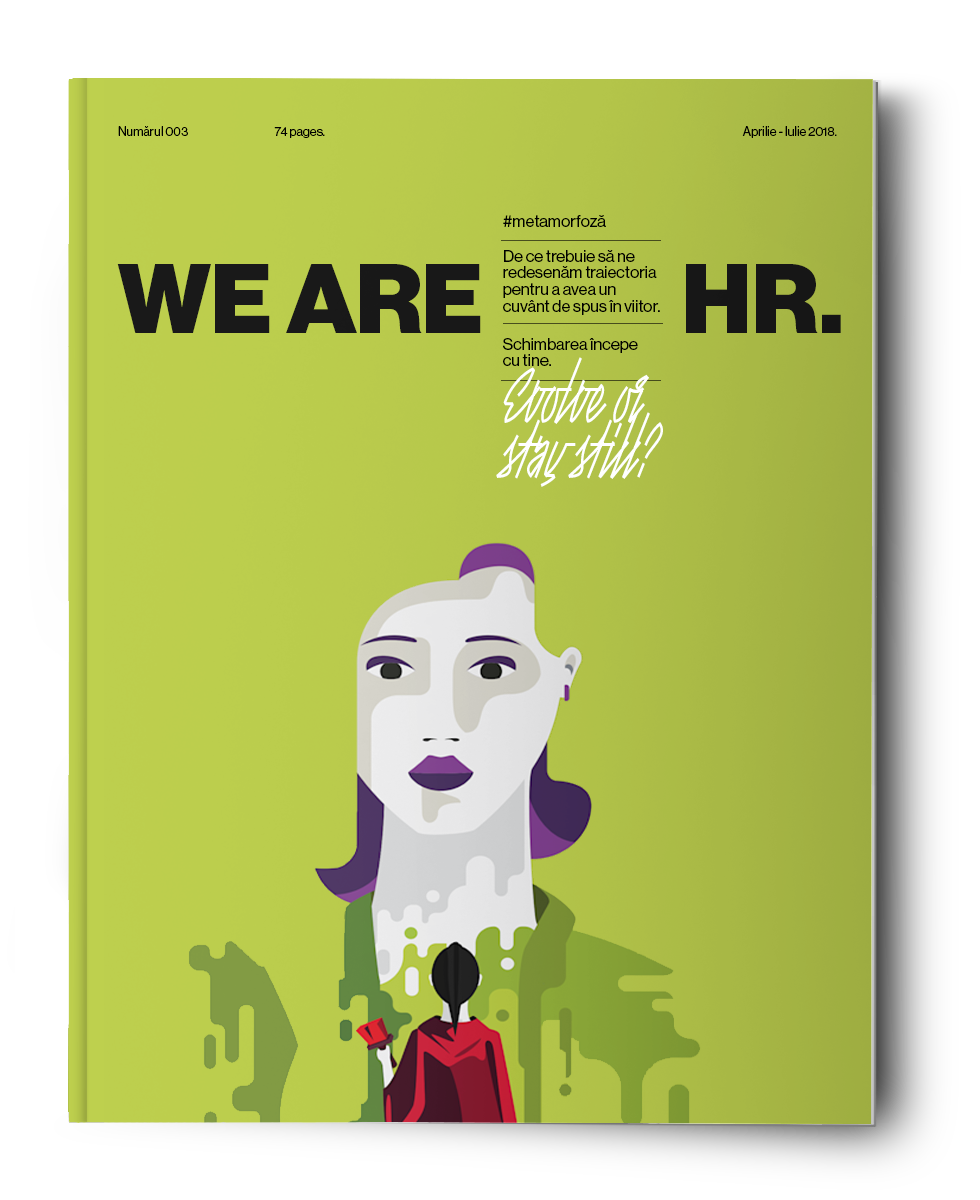
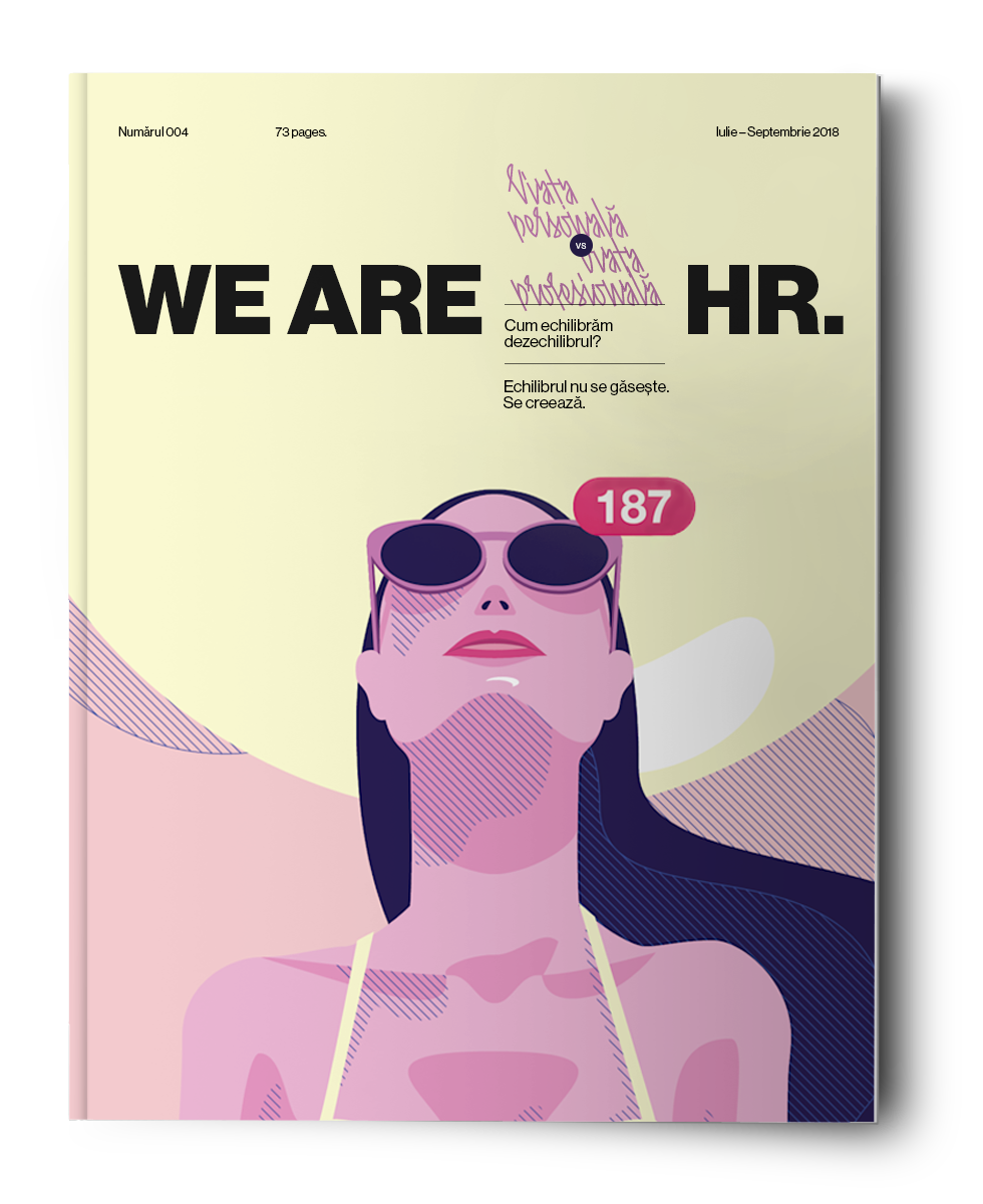
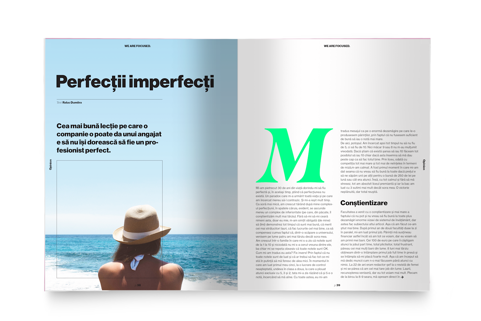
We Are HR
Modernising the brand of a niche management magazine.
Modernising the brand of a niche management magazine.
The observation
HR is not what you think it is
HR stands for Human Resources. That framing has always been part of the problem; it flattens an entire field of human complexity into an administrative category. The opportunity was to treat the initials as something open; not a fixed abbreviation but a canvas, a starting point, something that could mean something different each time it appeared.
Just as "We, the People" became a rallying call rather than just a legal preamble, WE ARE HR. could signal a shift in how the field sees itself. That reframe became the foundation for everything that followed.
The concept
We, the HR
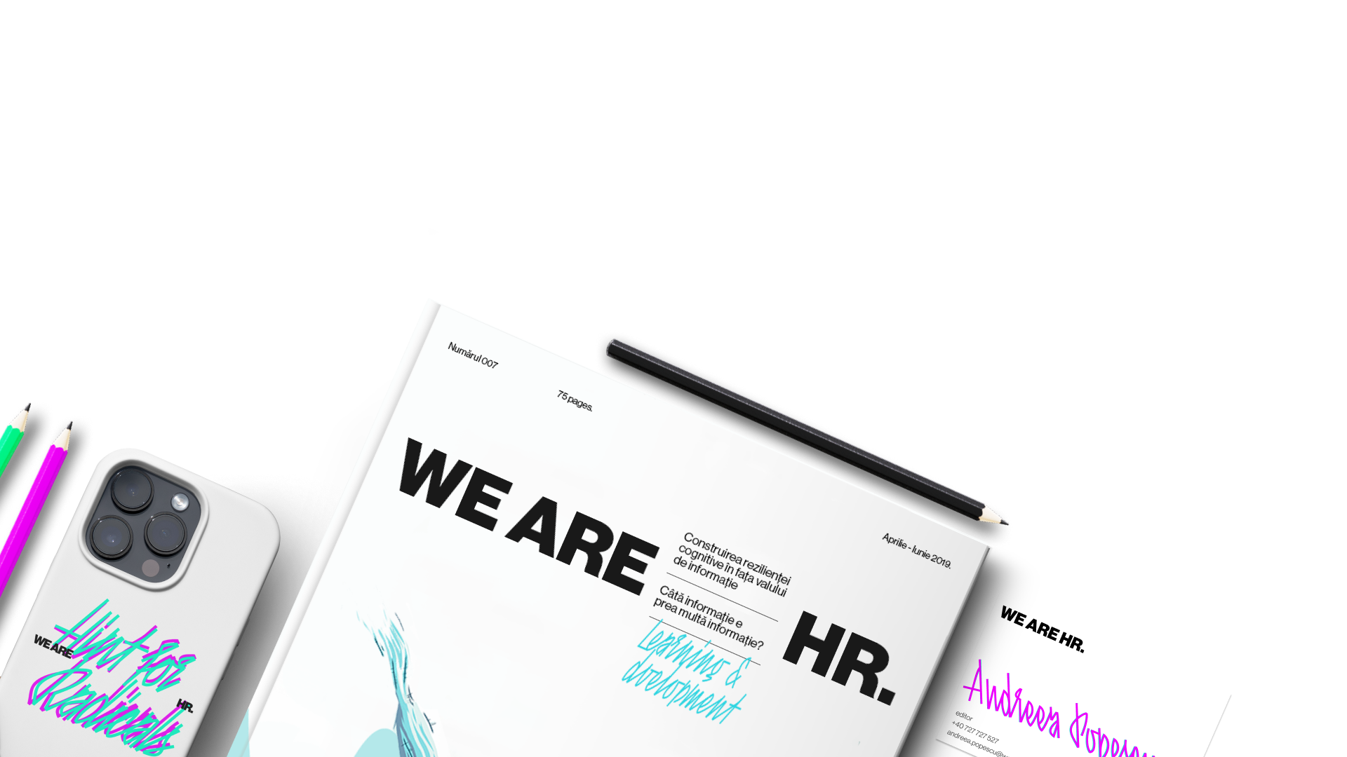
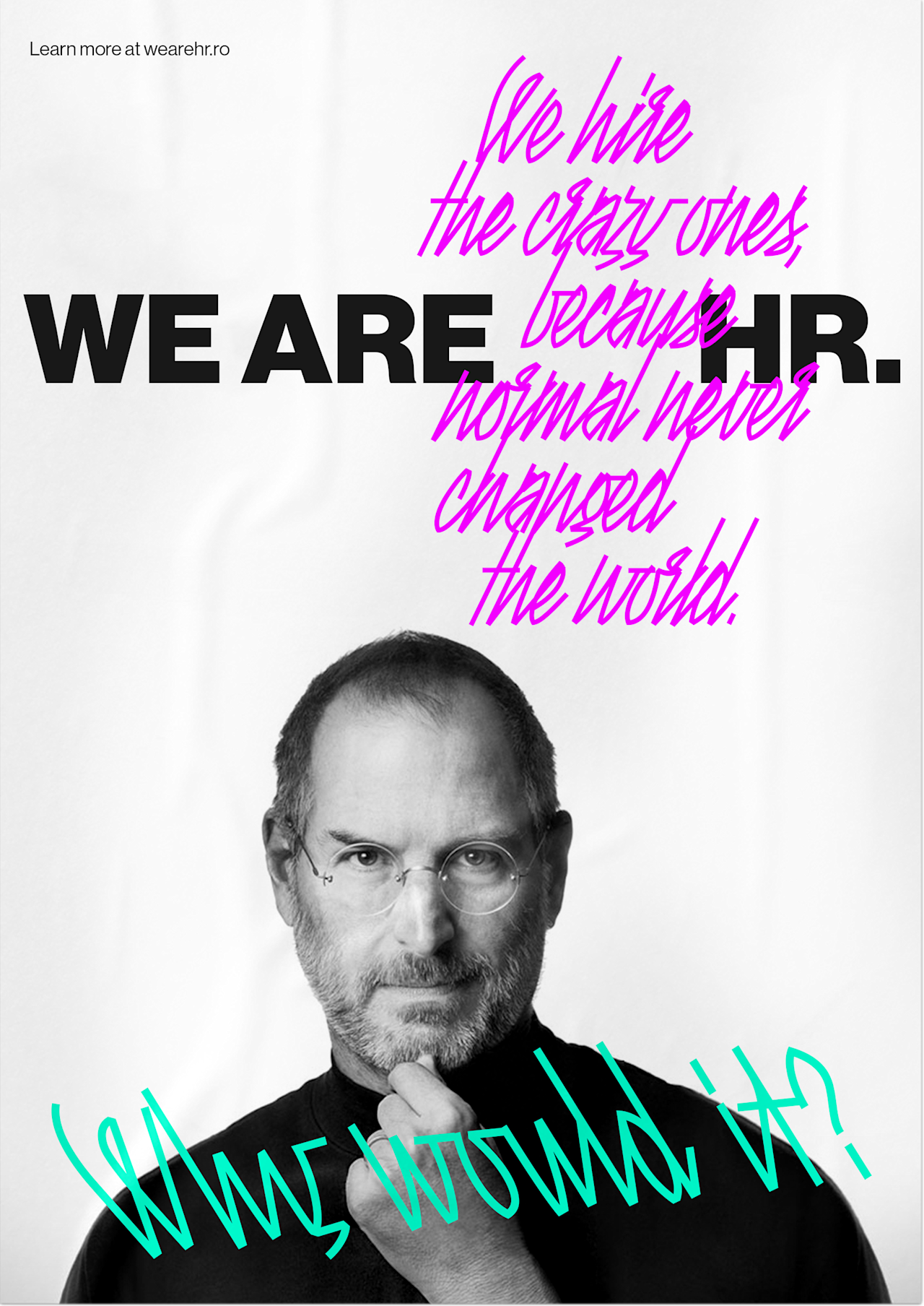
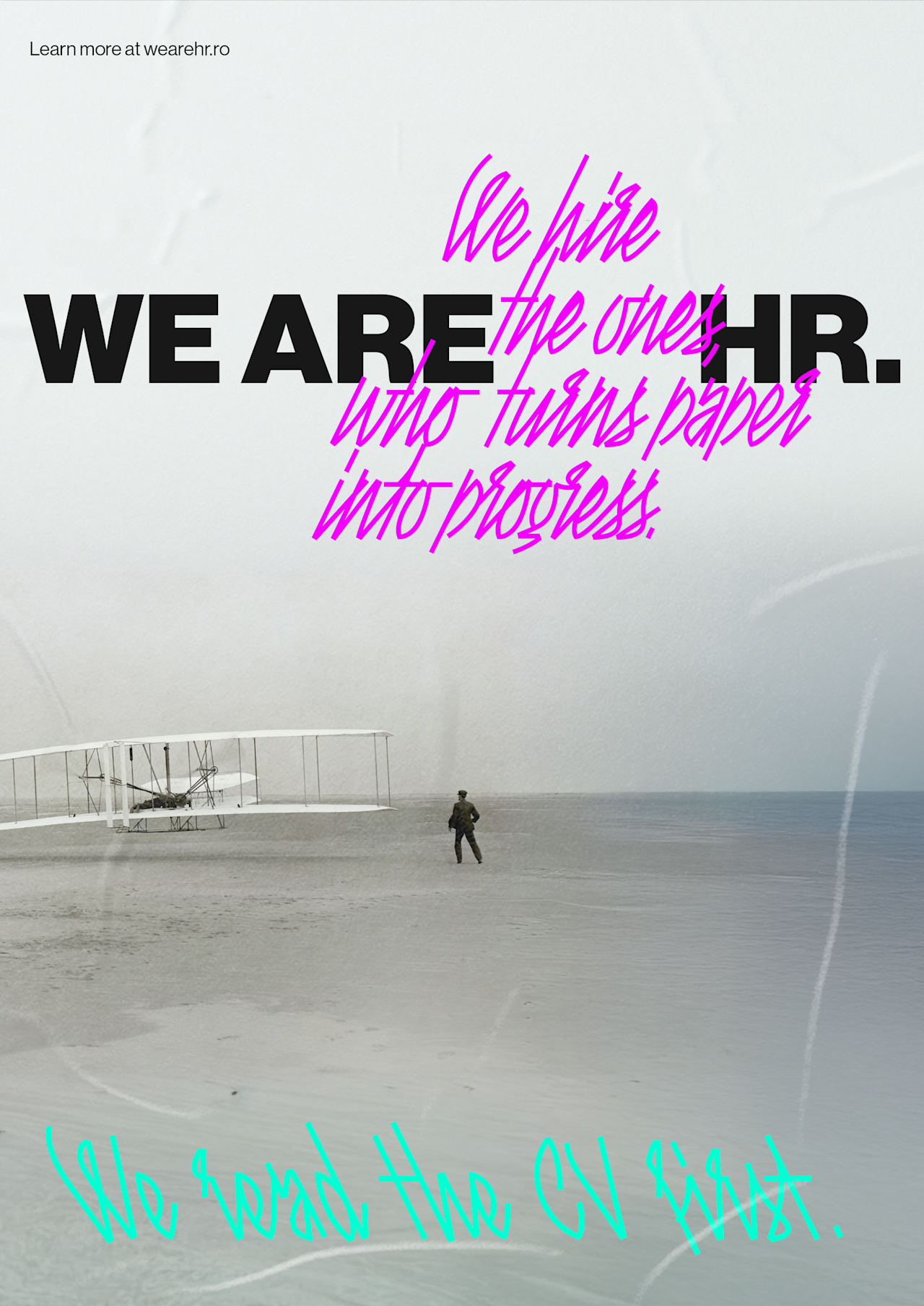
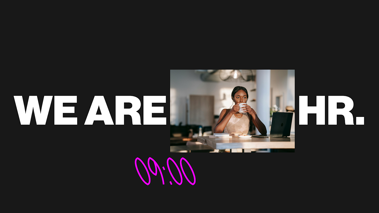
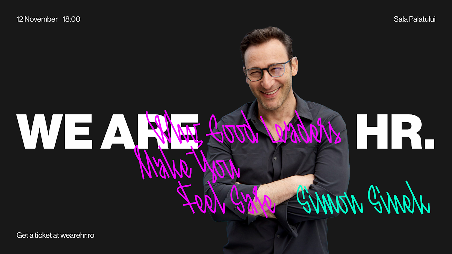
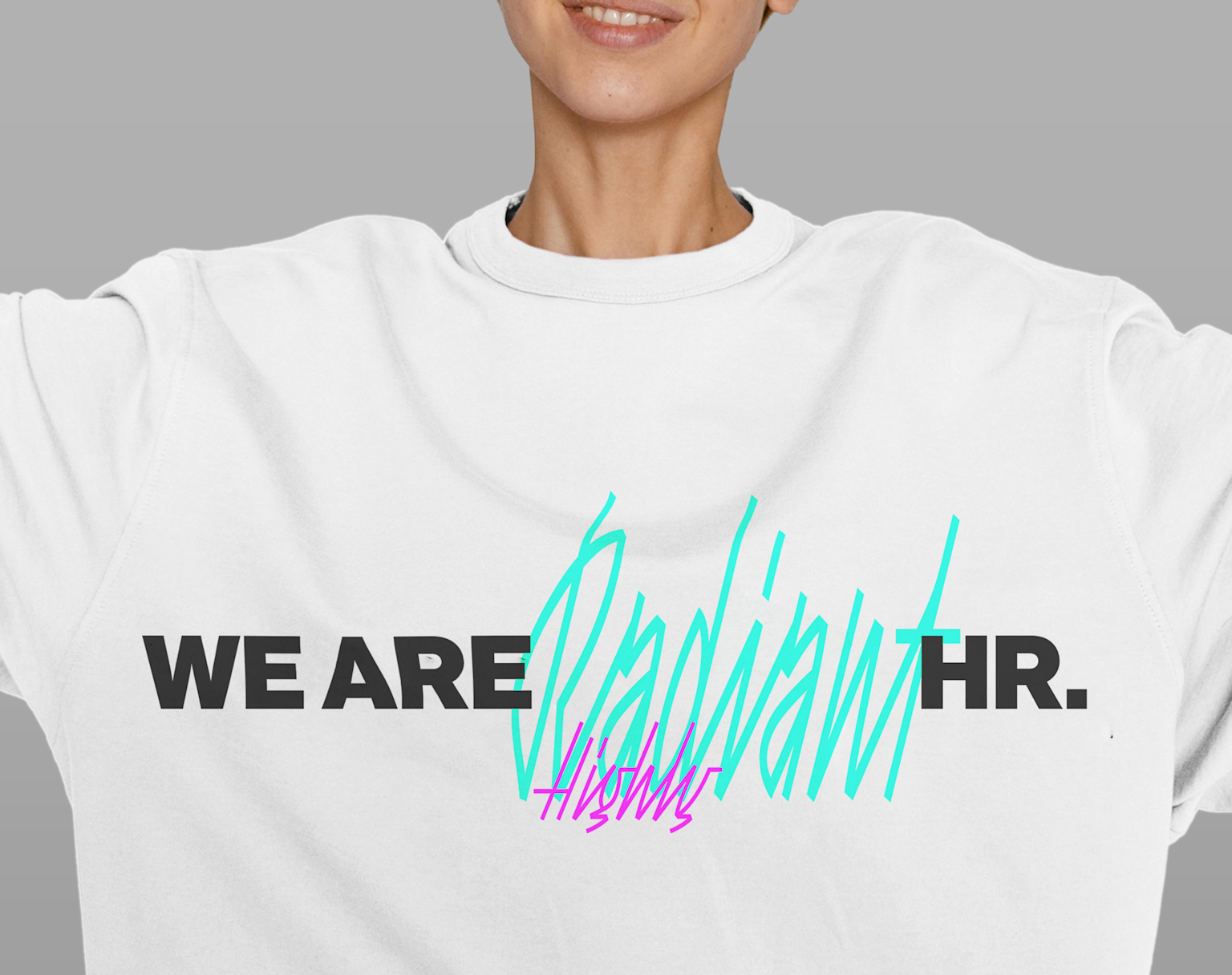
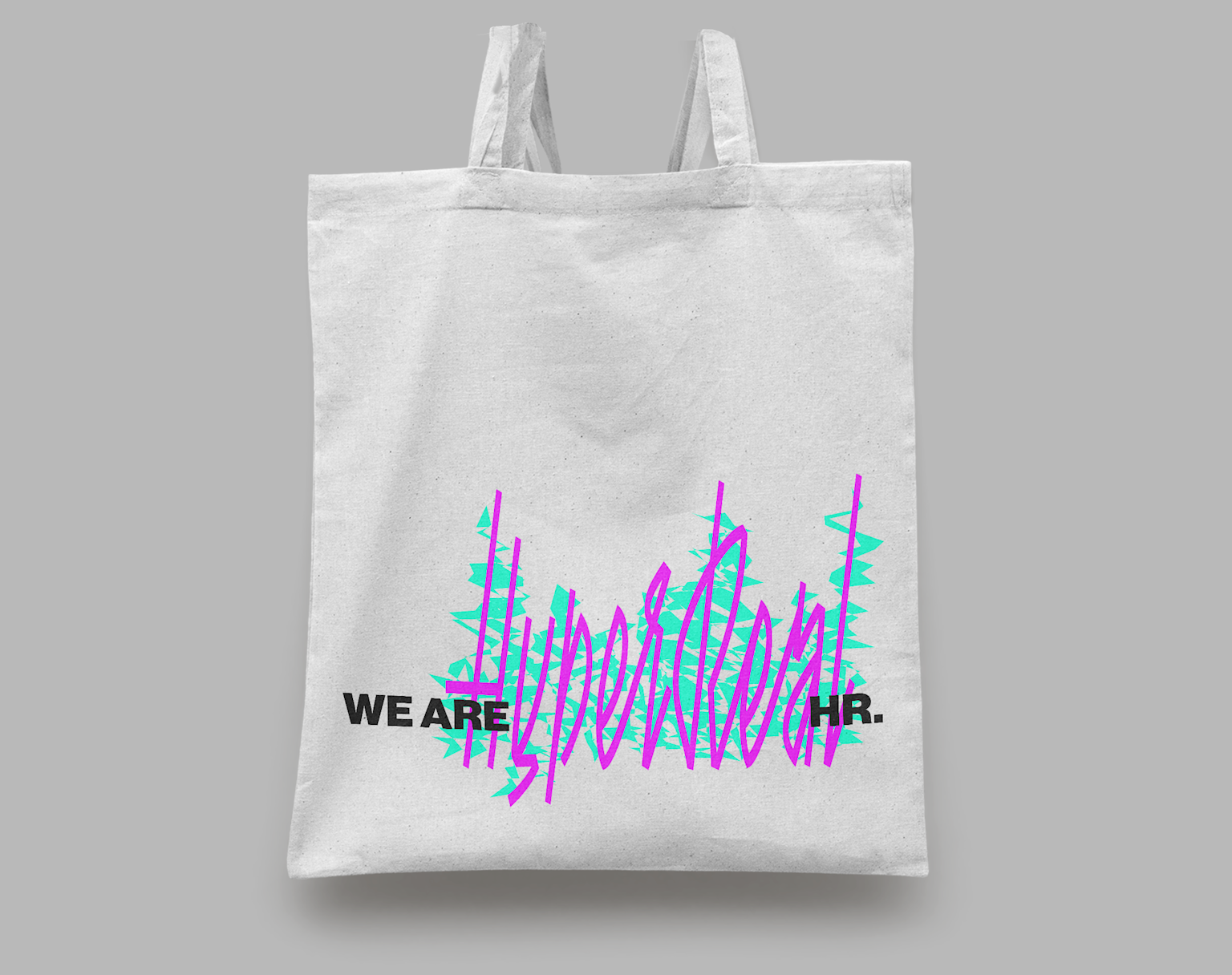
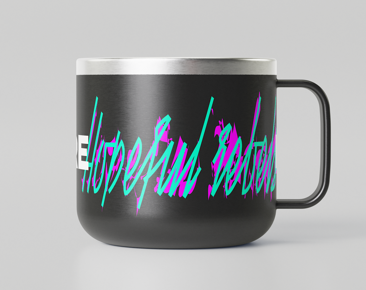
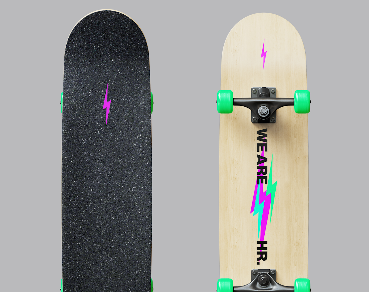
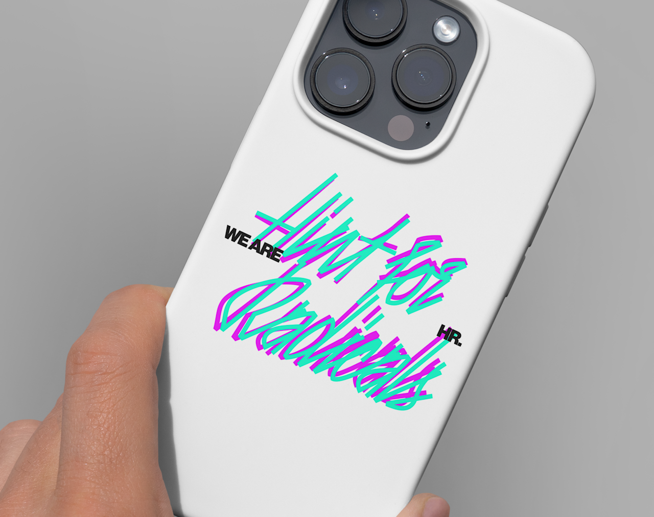
The central idea is a lockup with a variable middle. WE ARE HR. with a word inserted between; Hyper Real one issue, Honest Rebels the next, whatever the following issue demands. The structure stays fixed. The expression changes every time.
Each issue becomes its own statement. A perspective, a provocation, a moment the publication is responding to. The identity is not a finished thing; it moves with the conversation.
The art direction
A modern kind of revolution
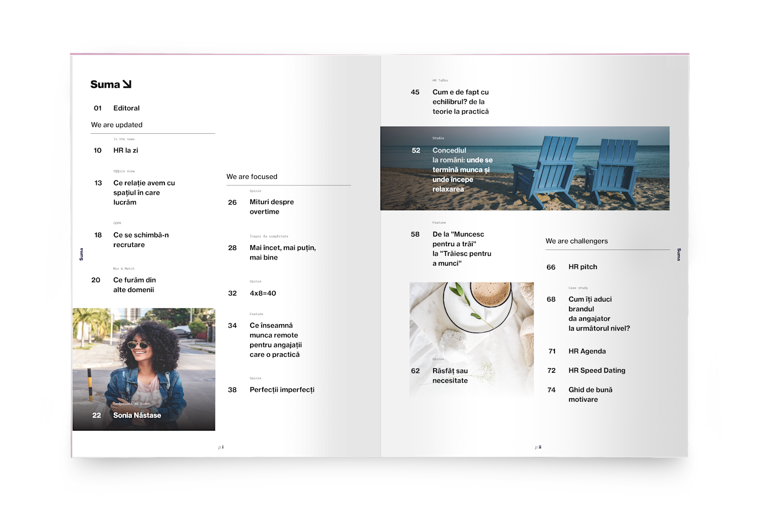
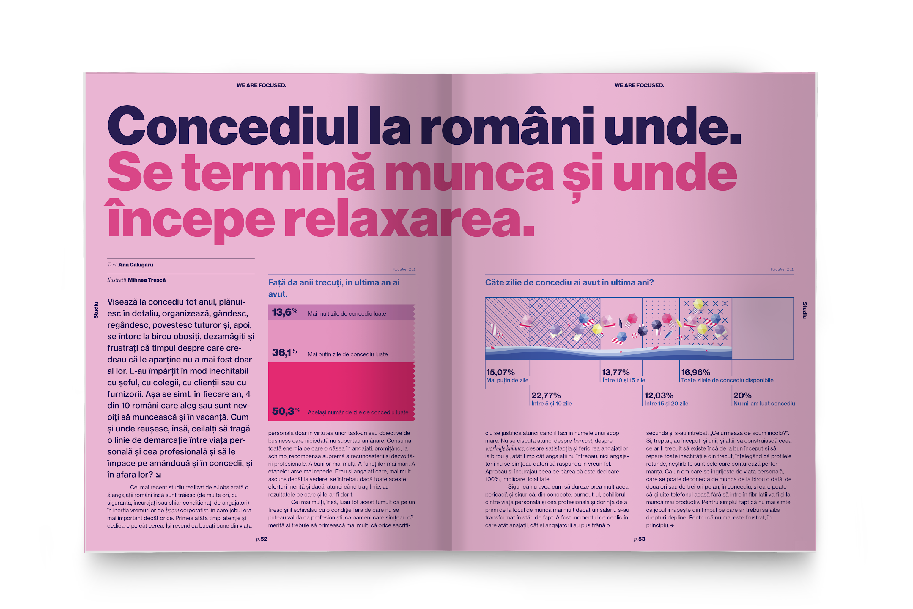
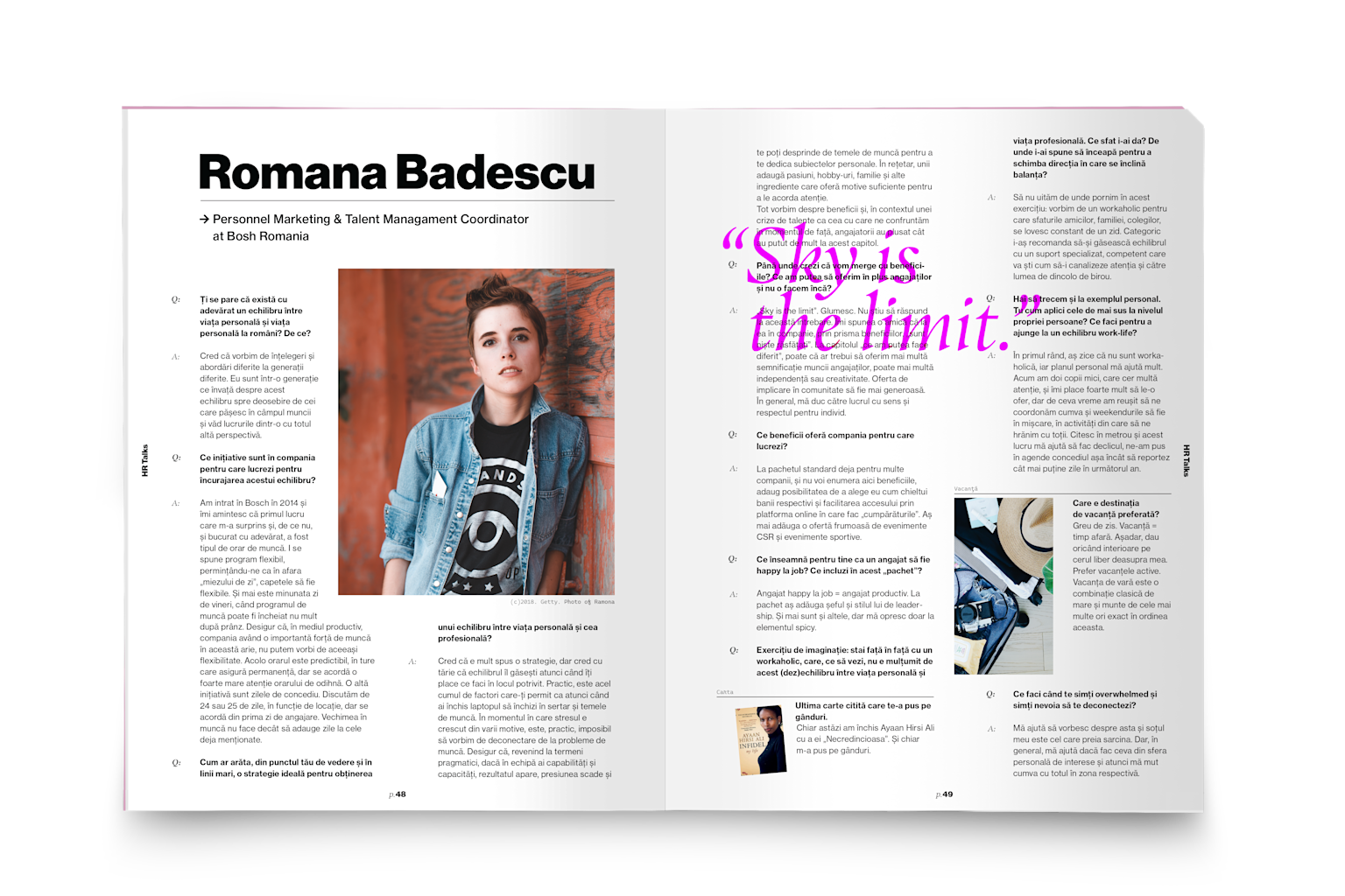
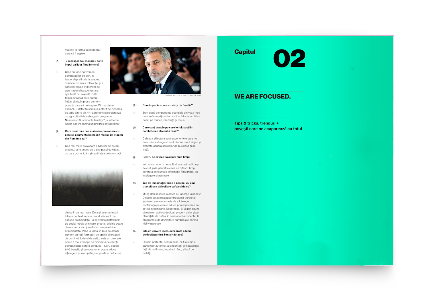
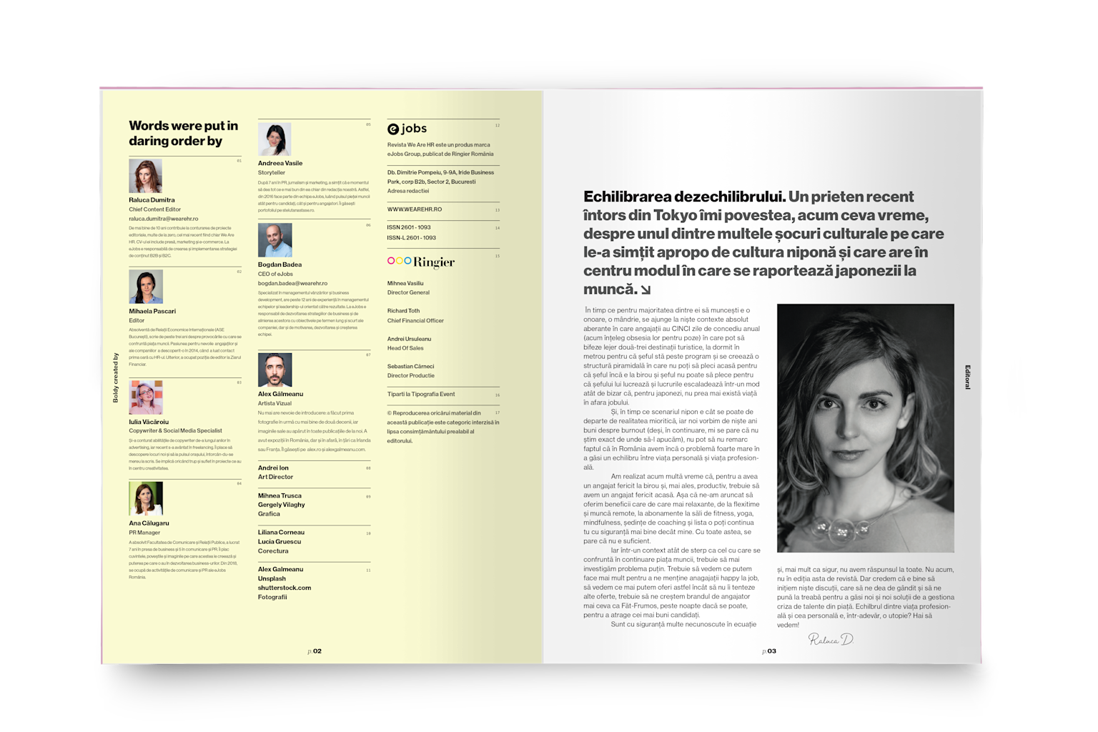
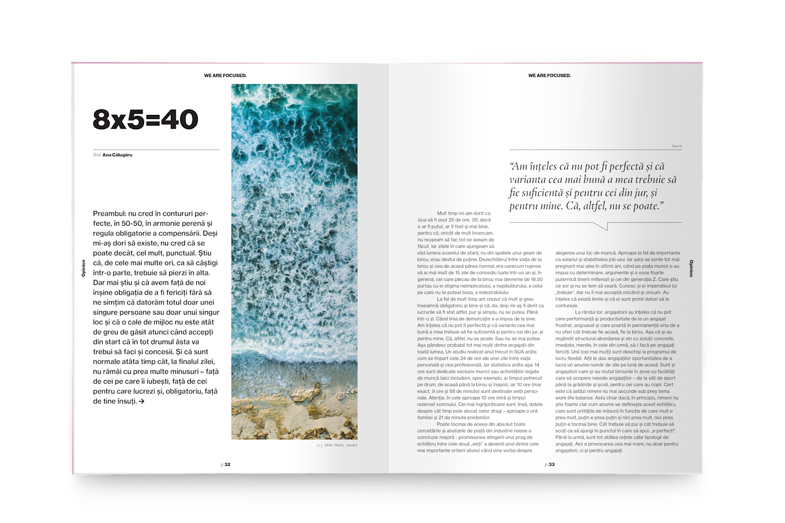
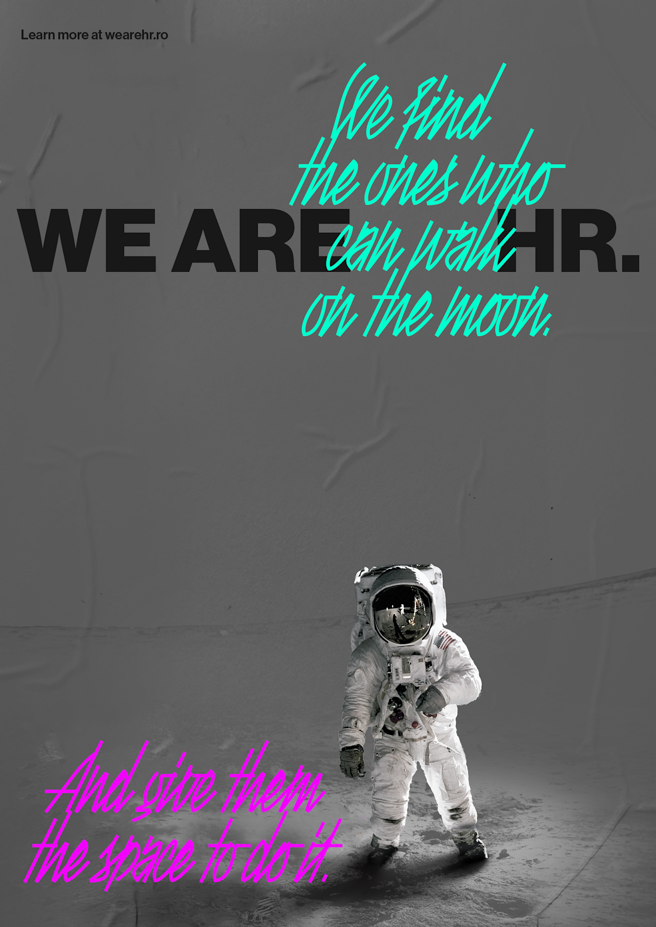
The visual language had to match the editorial ambition. Bold typographic system built around the variable lockup. Neon colour injections against black and white. The energy of protest graphics and editorial design; direct, unapologetic, hard to scroll past.
The rebellion is not in grand statements. It is in the consistency of the small ones; pushing back against the visual conventions the HR field has settled into, issue after issue.