Vedcode
Brand, strategy, and design. Shaping a new digital agency with a distinctive position from India to the global market.
Brand, strategy, and design. Shaping a new digital agency with a distinctive position from India to the global market.
The observation
Product design is the harder sell but the better bet
Having worked with the founding team before in India, I had seen their operation up close. They were primarily doing outsourced coding work, and occasionally trying to sell product design on the side. My recommendation was to flip that: lead with product design, not engineering. It is a more valuable proposition, harder to commoditise, and signals a fundamentally different kind of partner to global clients. That shift in positioning shaped everything that followed: the name, the identity, the website, and the message. The brand needed to combine substance with distinctiveness; something rooted in where Vedcode comes from, designed to travel far beyond it.
The strategy
A partner in full-cycle digital product development
Vedcode's positioning rests on a simple but important distinction: they do not just build what clients spec out, they help figure out what to build. By bringing together product design thinking, communication strategy, and strong engineering depth, the agency can guide clients from early concept through to delivery. That full-cycle capability, backed by a new generation of creative, tech-savvy graduates from India's rich local talent pool, is the offer.
The visual identity
I/O VEDCODE
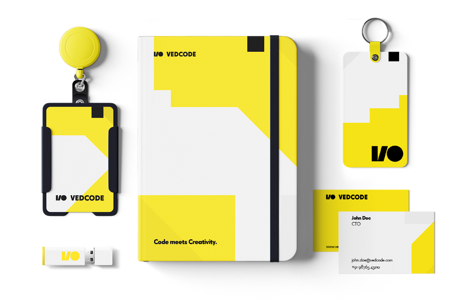
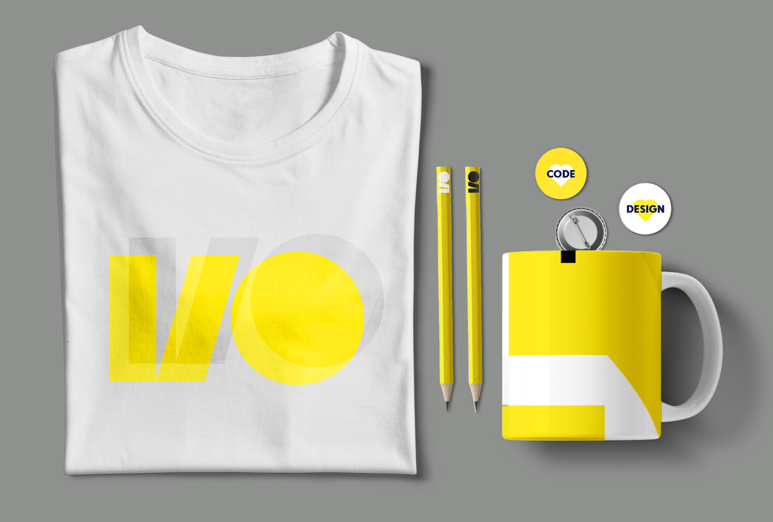
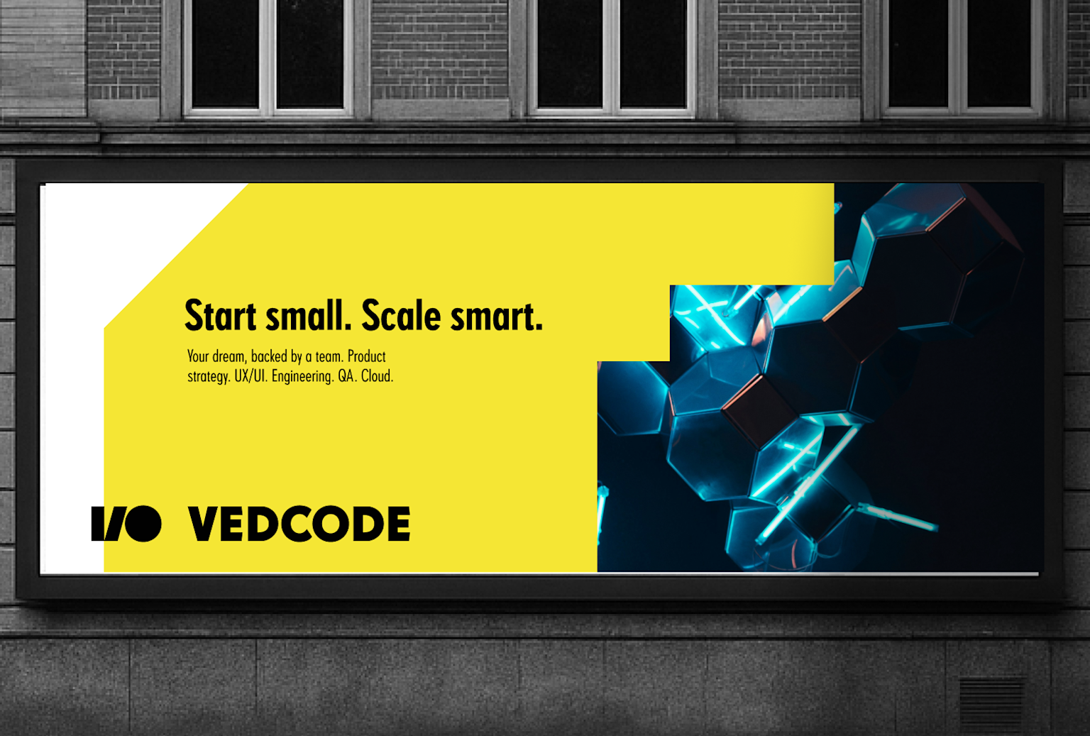
The logotype translates the name into a visual idea. "Code" becomes the starting point; specifically the binary system, the most elemental expression of how software thinks. I/O, input and output, is the foundation of every digital process. Structured, minimal, and immediately legible, the mark uses bold colour blocks and clean geometry to create something that feels rooted in the logic of technology without being cold or corporate.
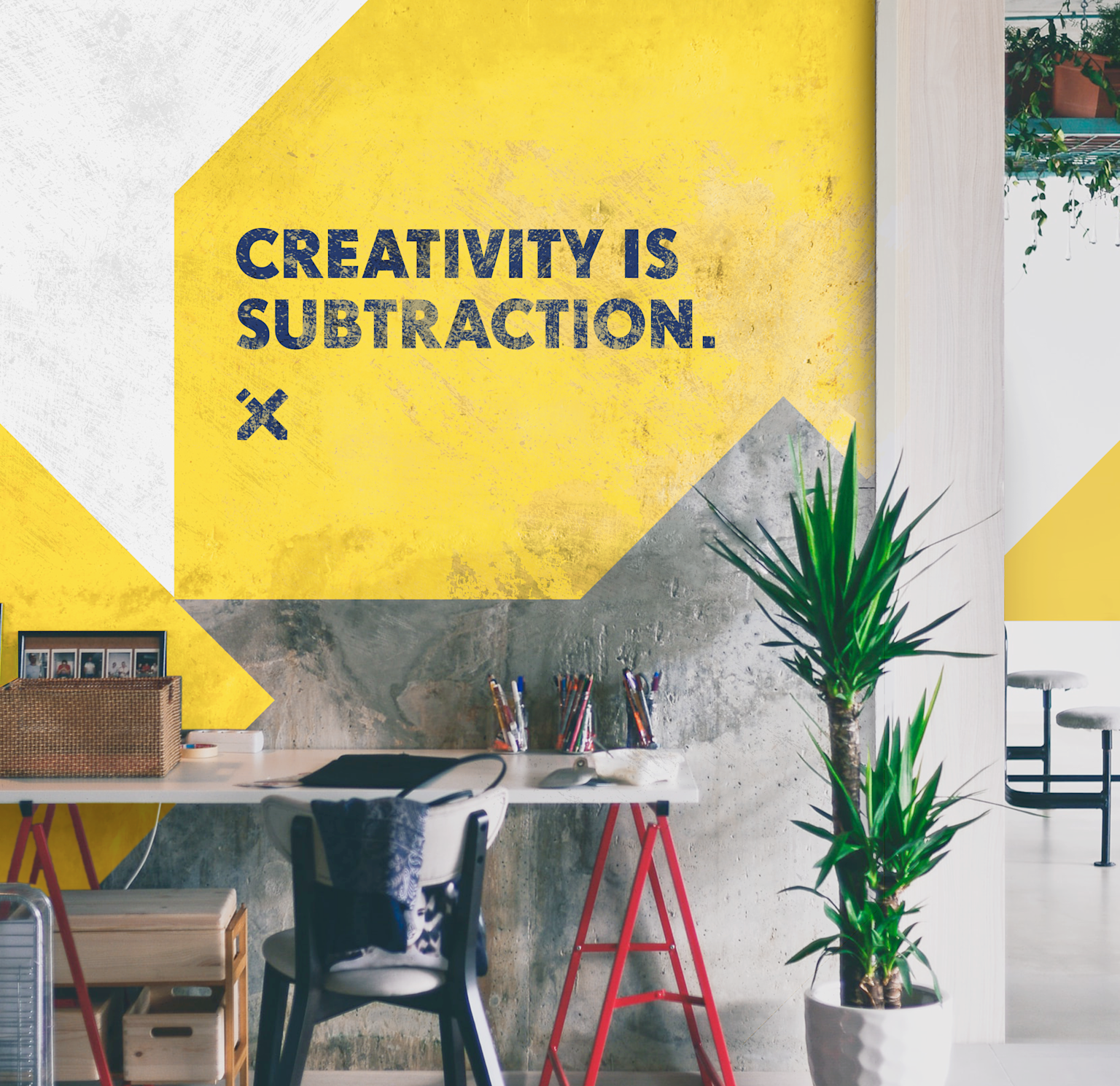
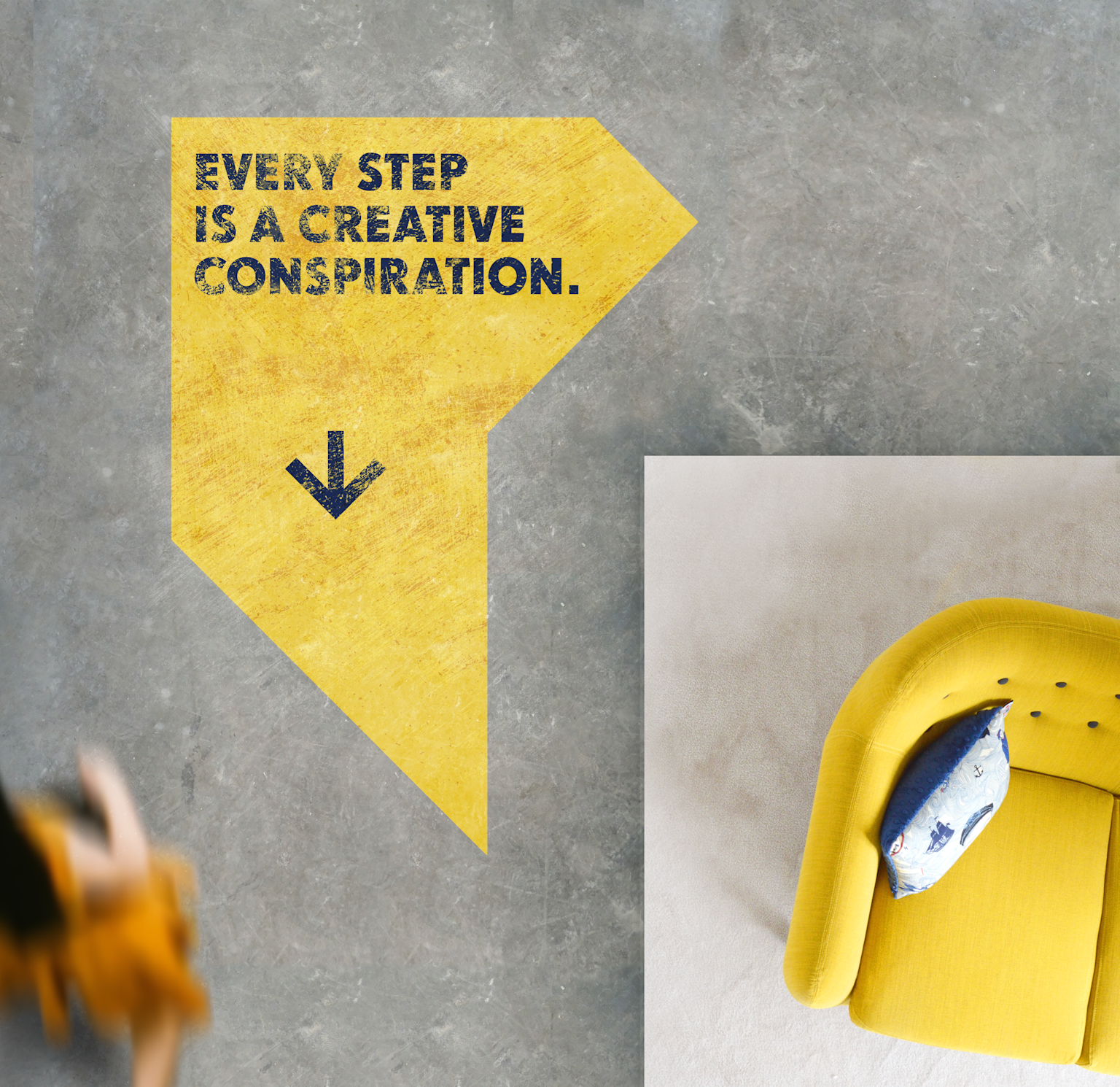
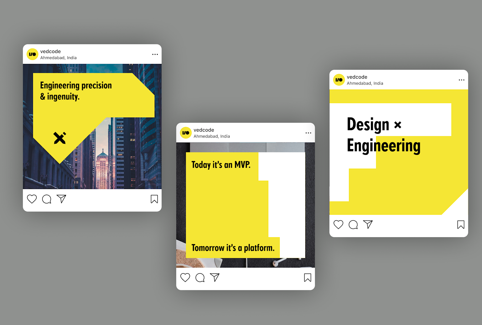
The visual language extends the same principle: bold yellow against black and white, high contrast, no decoration. Creativity is subtraction; that was the internal compass for every design decision. The fewer elements fighting for attention, the stronger each one lands.
The application
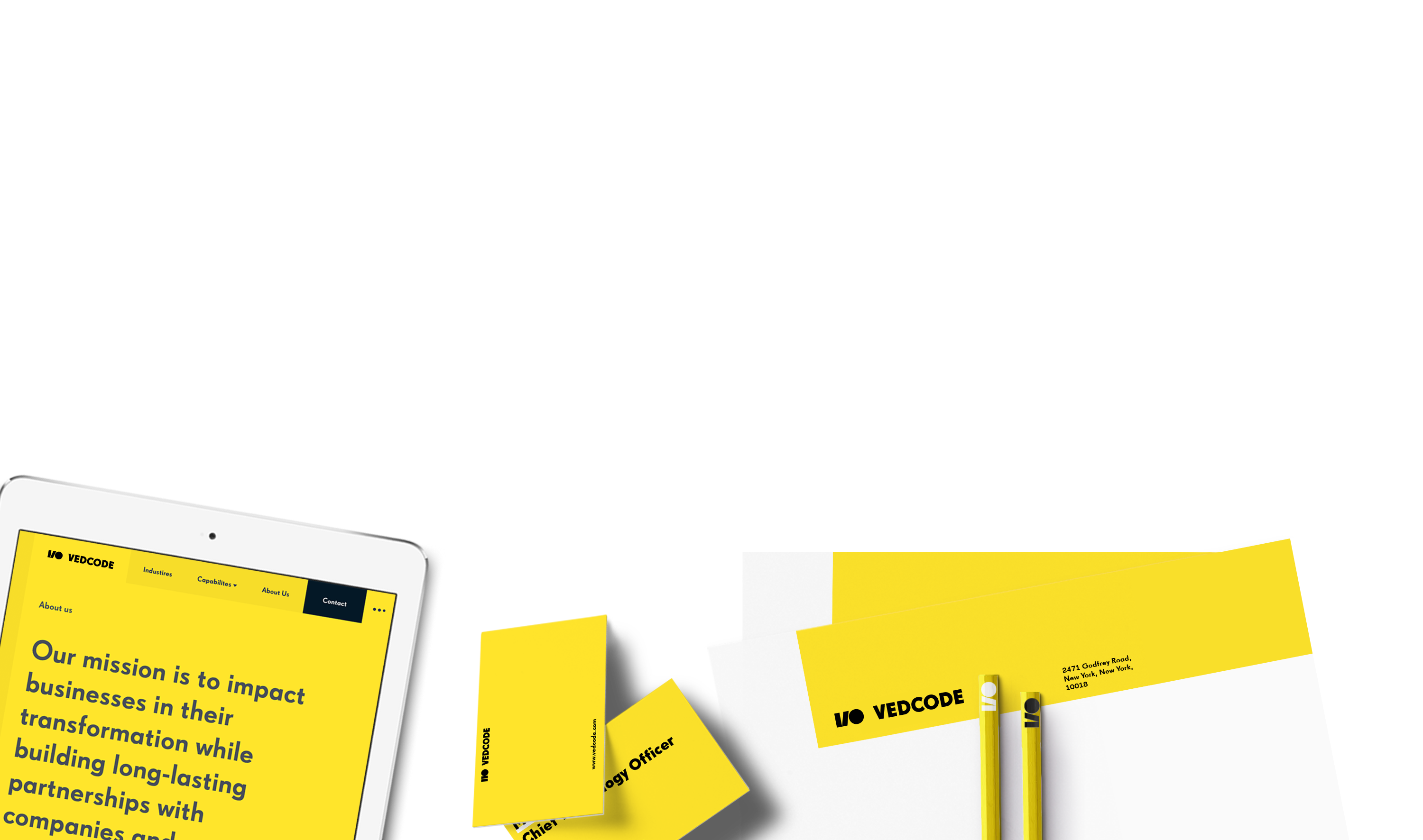
Beyond the brand identity, I helped develop the structure and content direction of the website — the architecture of how Vedcode presents its capabilities and builds the case for its positioning. The visual design carried the identity system through to digital, ensuring the same confidence and clarity on screen as in print.